Accessibility-aware development: what it means when we say it
Not a checklist run before launch. Semantics first, keyboard before mouse, state announced when it changes, and testing with the screen readers people actually use — JAWS, NVDA and VoiceOver — including inside a live video call.
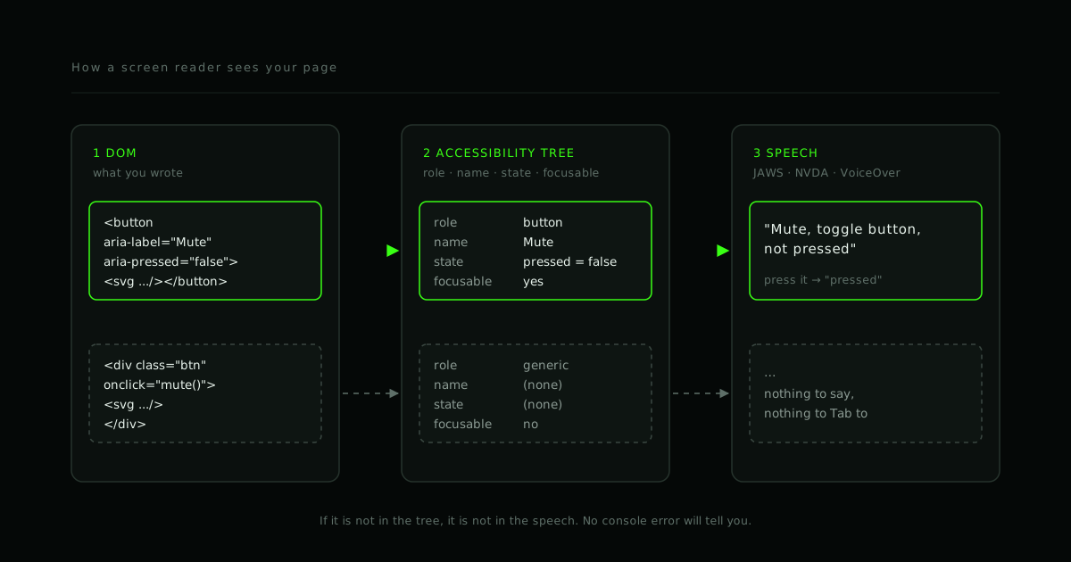
A mute button that a screen reader announces as "button" is a broken mute button.
It renders perfectly. It passes every visual QA pass. Nothing in the console
complains. And a user who cannot see the icon has no idea what it does, whether
they are currently muted, or — if it is a div with a click handler — that it is
there at all.
That is the whole problem in one control, and it is why we say accessibility-aware development rather than "accessibility". Accessibility as a noun tends to become a phase: an audit near the end, a spreadsheet of findings, a sprint of patches. Accessibility-aware is an adjective on the development. It describes how the components get built in the first place.
Four habits carry most of it.
1. Semantics first, ARIA second
Browsers do not hand your DOM to a screen reader. They build a second structure from it — the accessibility tree — where every node has a role (button, heading, list, textbox), a name ("Mute", "Search") and state (pressed, expanded, checked, disabled). JAWS, NVDA and VoiceOver read that tree. They never see your CSS, your icon font, or the colour you chose for "active".
Native elements populate the tree for free. <button> gets the button role,
keyboard focus, Enter and Space activation, and a name from its text content.
A <div onClick> gets none of that, and every piece has to be bolted back on
by hand:
<!-- Looks identical. Is not. -->
<div class="btn" onclick="mute()">
  <svg aria-hidden="true">…</svg>
</div>

<button type="button" aria-label="Mute" aria-pressed="false" onclick="mute()">
  <svg aria-hidden="true">…</svg>
</button>
The W3C's Using ARIA note opens with the first rule of ARIA: if a native
element already has the semantics and behaviour you need, use it, rather than
repurposing something else and adding ARIA to it. ARIA can only describe; it
cannot make a div focusable or give it keyboard behaviour. Used carelessly it
also removes information — role="presentation" on the wrong element, or
aria-hidden="true" on a container that still holds focusable children, and
content vanishes from the tree while remaining perfectly visible.
Practically: reach for <button>, <a href>, <label for>, <fieldset>,
<nav>, <main>, <h1>–<h6>, <dialog> and <table> before anything
custom. Add ARIA when the native vocabulary genuinely runs out — a tab list,
a tree view, a live region — and follow the documented pattern rather than
inventing one.
2. Keyboard before mouse
If a control cannot be reached with Tab and operated with Enter, Space or the arrow keys, it does not exist for a screen reader user, a switch user, or anyone whose hands are on the keyboard because that is faster. This is also the cheapest habit to check: unplug the mouse for ten minutes.
What you are looking for:
- Everything interactive is in the Tab order, in an order that matches the
visual layout. Custom widgets get
tabindex="0"on the one element that should receive focus, not on every child. - Focus is visible. A
:focus-visibleoutline that meets contrast, notoutline: nonebecause the designer disliked the ring. - No traps. You can Tab into a widget and Tab, Shift+Tab or Escape out of it. Modals hold focus while open and return it to the trigger when closed.
- Composite widgets use arrow keys internally — one Tab stop for a tab list or a toolbar, arrows to move within it. Sixty Tab presses to cross a toolbar is technically reachable and practically unusable.
- Nothing depends on hover. If information or a control appears only on mouseover, it appears for nobody else.
3. State is announced when it changes
A sighted user watches the microphone icon get a red line through it. A screen reader user needs the same fact delivered as speech, at the moment it changes, without having to go looking for it.
Two mechanisms cover nearly all of it.
State attributes on the control itself. A toggle carries aria-pressed;
a disclosure carries aria-expanded; a checkbox is a checkbox. When the value
changes, screen readers announce the new state because focus is already on the
control. This is what turns "button" into "Mute, toggle button, pressed".
Live regions for things that happen elsewhere. A participant joined. The
connection fell back to relay. A chat message arrived. Focus is nowhere near any
of that, so the update goes into an aria-live region and the screen reader
speaks it when it can:
<div aria-live="polite" aria-atomic="true" class="sr-only" id="call-status"></div>
function announce(message) {
  const region = document.getElementById('call-status')
  region.textContent = ''            // force a change even for repeated text
  requestAnimationFrame(() => { region.textContent = message })
}

announce('Sara joined the call')
polite waits for the current utterance to finish; assertive interrupts. Use
assertive for almost nothing — "call ended" and "you have been disconnected"
qualify, "new message" does not. And rate-limit it. A live region that fires
on every network-quality tick is a screen reader that never stops talking, and
users will turn it off, taking your genuine announcements with it.
4. Test with the real thing
Automated scanners — axe, Lighthouse, the browser's accessibility panel — are
worth running on every build. They find the mechanical problems reliably:
missing alternative text, low contrast, an input without a label, a duplicate
id. Run them.
They cannot tell you whether the reading order makes sense, whether focus went somewhere useful when the dialog closed, whether the live region fired once or forty times, or whether "Mute" is what a user would actually call that button. For that you sit down with a screen reader and use the product.
Which screen reader matters. In WebAIM's tenth Screen Reader User Survey (1,539 respondents, fielded December 2023 to January 2024), respondents named JAWS as their primary desktop screen reader most often (40.5%), with NVDA close behind (37.7%) and VoiceOver third (9.7%). Asked which screen readers they commonly use at all, NVDA led (65.6%) with JAWS second (60.5%). Chrome was the most common browser (52.3%).
So the working set for a web product is: NVDA on Windows (free, strict, and what most respondents use), JAWS on Windows (what most call their primary reader, and what enterprise and government desktops tend to ship with), and VoiceOver on macOS and iOS. Test with at least the first two. We have written up how we run each: testing with NVDA and testing with JAWS.
What this looks like inside a video call
Most of our work is real-time communication, and a call screen is close to a
worst case for accessibility. Everything is an icon. State changes constantly
and mostly without user action. There is a grid of people, a chat panel, a
device picker, a join flow with permission prompts, and a lot of it was built
from divs because the design system did not have a "microphone" component.
The same four habits, applied:
| Element | What it needs |
|---|---|
| Mute, camera, screen share | <button aria-pressed> with a name; state read back on toggle |
| Leave / end call | A real button, named, with a confirmation that is itself keyboard-operable |
| Participant tiles | A name per tile; speaking and muted state exposed as text, not only a glow |
| Join / leave events | One polite live region, rate-limited: "Sara joined", "Tom left" |
| Connection quality | Announce transitions that matter ("connection poor"), not every tick |
| Device picker, settings | Native <select>, or a <dialog> that traps focus and returns it |
| Chat | Incoming messages into a polite region; the input is a labelled textbox |
| Captions / transcript | A first-class feature, not a plugin, and reachable from the keyboard |
| Motion and effects | Honour prefers-reduced-motion; no intro animation on the way into a meeting |
None of this is exotic. It is the ordinary discipline of naming things and telling the user what changed, applied to a surface that changes a lot.
The standards, briefly
The bar we build to is WCAG 2.2 Level AA. It is what the regulations point at. In Europe, EN 301 549 incorporates WCAG for public-sector procurement, and the European Accessibility Act has applied to a broad range of consumer digital products and services since June 2025. In the United States, the Department of Justice's 2024 rule under the ADA requires state and local government web content and apps to meet WCAG 2.1 AA on deadlines beginning in 2026, and private-sector accessibility litigation routinely cites WCAG as the measure.
If you sell to governments, universities, healthcare or large employers, an accessibility conformance report is increasingly part of the procurement paperwork. It is a great deal cheaper to have built for it than to be asked for it.
What we actually do
- Build new interfaces accessible from the first component — semantics, keyboard, focus management and announcements as acceptance criteria, not a later ticket.
- Audit existing products against real assistive technology — NVDA, JAWS and VoiceOver on the flows your users actually take — with findings ranked by impact, not by scanner severity.
- Remediate in priority order, with a regression check so fixes stay fixed.
- Leave the team able to test — a short written routine, the keys that matter, and how to read what the screen reader says instead of guessing.
The mute button is still the test. When it says "Mute, toggle button, not pressed", and pressing it says "pressed", the rest of the call UI is usually close behind.
Next: testing with NVDA, the free screen reader every developer on Windows can install today, and testing with JAWS, the one your enterprise users are most likely to have.
- #Accessibility
- #WCAG
- #ARIA
- #Screen readers
- #WebRTC
Working on this?
We build accessible products and audit existing ones.
If your product has never been through a screen reader, that is the place to start. We test against JAWS, NVDA and VoiceOver, fix in priority order, and leave your team able to check it stays fixed.