A Flutter quantity widget with screen-reader semantics (with source)
A Flutter quantity stepper that shows screen readers one adjustable node, repeats on long-press with acceleration, takes keyboard and typed input, and works as a real FormField. Source, tests and an honest comparison.
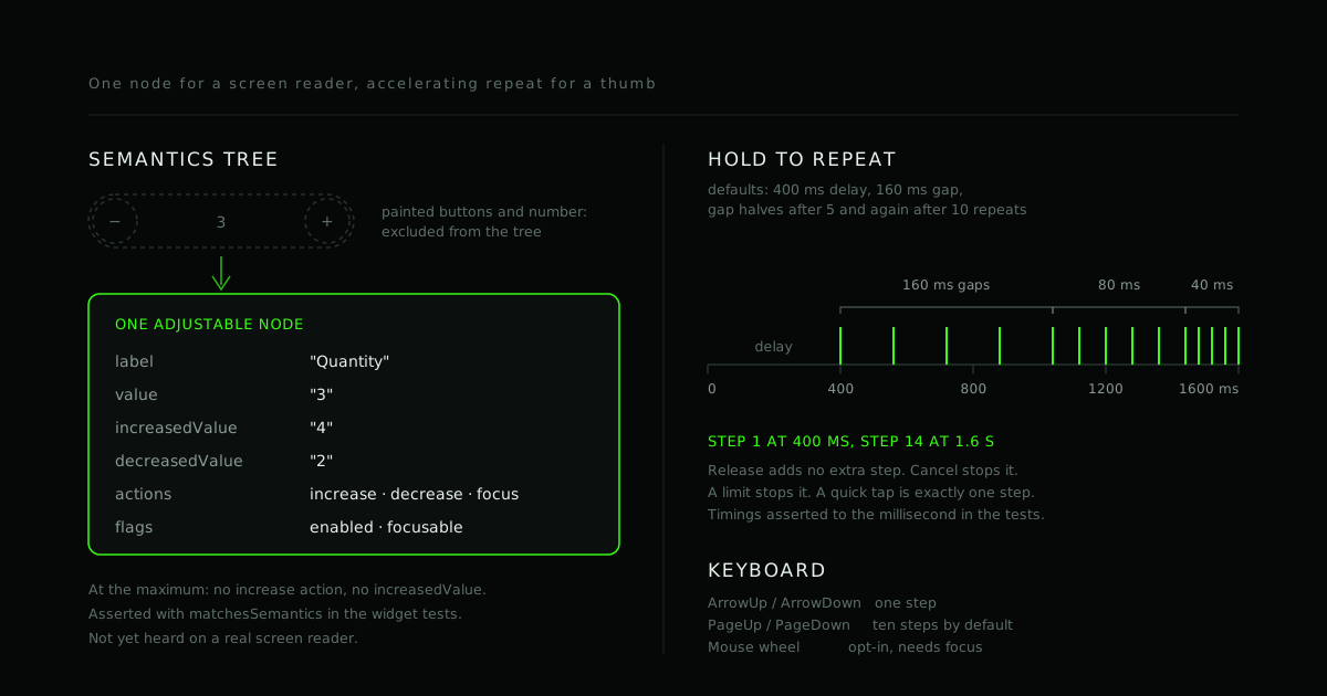
A minus button, a number, a plus button. The quantity input is the simplest widget in a shopping cart, and a quick version of it goes wrong in three places: the buttons have no name for a screen reader, holding a button does nothing, and manual typing into the middle either is not allowed or leaves the state out of step with the screen.
This post builds a Flutter quantity widget that gets those right. The code is
from quantity_stepper, an MIT-licensed Flutter package with no dependencies,
on pub.dev. Everything below comes
from its source or its tests. To try it:
flutter pub add quantity_stepper
What a good quantity control does
It moves by a small step from an increment and decrement button, and never leaves its minimum and maximum. It keeps going while you hold a button, like any spinner control. It accepts typing when the numbers get big, tells assistive technology what it is and lets it adjust the value, works from the keyboard, and drops into a form.
Sometimes it is the wrong control. For counts that reach the hundreds, a plain
text field with a numeric keyboard is faster than pressing plus. For something
approximate, like a volume, use a Slider. For named choices, use a dropdown or
segmented button. A stepper input earns its place for small counts: guests,
seats, items in a cart.
The state and the limits
The value is an int, with min, max and step. Every path that changes it,
whether a tap, key, typed text or screen-reader action, goes through one clamp:
int _clamp(int v) {
  final int? max = widget.max;
  if (max != null && v > max) {
    return max;
  }
  if (v < widget.min) {
    return widget.min;
  }
  return v;
}
Bad input limits fail loudly: the constructor asserts step > 0,
min <= max and a non-empty label. Programmatic control works the way Flutter's
own inputs do. Pass value and onChanged and the parent owns the state:
QuantityStepper(
  label: 'Quantity',
  min: 1,
  max: 10,
  value: _quantity,
  onChanged: (int q) => setState(() => _quantity = q),
)
Pass initialValue instead and the widget keeps its own. onChanged never
reports the same value twice in a row.
Typing and validation
Set editable: true and the value becomes a numeric input field. A formatter
keeps digits, plus a leading minus only when min is negative, up to nine
digits. The widget owns the text editing controller, so the interesting part is
deciding when text becomes a value:
void _handleTextChanged(String text) {
  final int? typed = int.tryParse(text);
  if (typed == null || typed < widget.min) {
    return;
  }
  final int? max = widget.max;
  if (max != null && typed > max) {
    return;
  }
  _setValue(typed, announce: false, rewriteText: false);
}
A number in range applies as you type. Anything else, including an empty field,
waits. On submit or when the field loses focus it is clamped (150 becomes
99) or, if it is not a number, replaced by the current value.
Cursor behavior is the classic bug here. If every state change rewrites the text field, the caret jumps as you type. So the sync only touches the text when it no longer parses to the current value:
void _syncText({int? target, bool userIsTyping = false}) {
  final int value = target ?? _current;
  final String text = '$value';
  if (_textController.text == text) {
    return;
  }
  if (userIsTyping &&
      _textFocus.hasFocus &&
      int.tryParse(_textController.text) == value) {
    return;
  }
  _textController.value = TextEditingValue(
    text: text,
    selection: TextSelection.collapsed(offset: text.length),
  );
}
Type 05 and it stays 05 until you leave the field. Press plus and the text
becomes the new value, caret at the end; pending text is applied first and the
keyboard stays open. Input validation with custom messages belongs to the form,
below.
Long-press repeat
Holding plus should not need forty taps. The rule: a quick tap moves exactly one step, a hold starts repeating after 400 ms, and releasing a hold must not add one more step. The repeat is a chain of one-shot timers, so the gap can change:
void _fire() {
  _timer = null;
  _ticks++;
  if (onTick()) {
    _timer = Timer(gapAfter(_ticks, _interval), _fire);
  }
}

static Duration gapAfter(int ticksDone, Duration interval) {
  final int tier = math.min(ticksDone ~/ 5, 2);
  return Duration(microseconds: interval.inMicroseconds >> tier);
}
With the defaults the gaps are 160 ms for the first five repeats, 80 ms for the
next five, then 40 ms. The tests assert it to the millisecond: first step at
400 ms, fifth at 1040 ms, fourteenth at 1600 ms. A limit ends the repeat, and
autoRepeat: false turns it off.
Accessibility
This is the part a quick version usually skips. A screen reader does not see your
circles and icons; it sees the semantics tree. We checked what a bare pair of
GestureDetector buttons with Icons puts there: two nodes with a tap action
and no label, plus the number as a third, separate node.
Flutter has a better vocabulary for this control: one node that can be adjusted. It has a label, a value, the value it would have after an increase or a decrease, and increase and decrease actions.
Semantics(
  container: true,
  label: widget.label,
  value: _describe(current),
  increasedValue: canIncrease
      ? _describe(_clamp(current + widget.step))
      : null,
  decreasedValue: canDecrease
      ? _describe(_clamp(current - widget.step))
      : null,
  onIncrease: canIncrease
      ? () => _stepFromInput(_Direction.increase, announce: false)
      : null,
  onDecrease: canDecrease
      ? () => _stepFromInput(_Direction.decrease, announce: false)
      : null,
  enabled: enabled,
  child: Material(type: MaterialType.transparency, child: body),
)
The painted buttons and the number are excluded from the tree, so nothing is exposed twice. At a limit the action that would go past it is simply absent. The widget test asserts the whole node, flags and actions included:
expect(
  controlNode(tester),
  matchesSemantics(
    label: 'Quantity',
    value: '3',
    increasedValue: '4',
    decreasedValue: '2',
    textDirection: TextDirection.ltr,
    hasEnabledState: true,
    isEnabled: true,
    isFocusable: true,
    hasIncreaseAction: true,
    hasDecreaseAction: true,
    hasFocusAction: true,
  ),
);
Other tests run tester.semantics.increase and decrease and check the value
and onChanged, and check the disabled and at-limit nodes. Reading order in the
tests is Before, Quantity, After: one stop.
Announcements are opt-in (announceChanges). Flutter's own documentation
notes that Android has deprecated announcement events because they interrupt
TalkBack's speech queue. So the widget sends one announcement per burst of
changes, 400 ms after the last, and none for the screen reader's own increase
and decrease, assuming the platform speaks the new value itself.
Target size. Every button is at least 48 by 48 logical pixels. The compact
option, and a theme, shrink the painted circle inside that hit area, not the
area. A test measures every combination of compact and axis.
Keyboard. The control is one Tab stop. ArrowUp and ArrowDown move a step, PageUp and PageDown move ten by default, and the mouse wheel is opt-in and only works while the control has focus.
What we have not done is test with TalkBack or VoiceOver on real devices. The tests prove what the widget puts in the semantics tree, not what a platform screen reader does with it. Whether each one presents the node as adjustable is the first thing to check. We wrote up how we approach that in accessibility-aware development.
Using it in a form
QuantityStepperFormField is a FormField<int>, not a text field in disguise,
so validate, save and reset work like they do for any other field:
QuantityStepperFormField(
  label: 'Guests',
  initialValue: 1,
  validator: (int? n) => (n ?? 0) < 2 ? 'Add at least two guests.' : null,
  onSaved: (int? n) => _guests = n ?? 1,
)
The message shows under the control and outlines it in the error colour. It is
a live region where the platform does not support announcements, the same
arrangement Flutter's InputDecorator uses. autovalidateMode works as usual.
Package or build your own
You can build this in an afternoon: the buttons and the state are the easy part, and the time goes into the repeat, semantics, typing and form. If your design is unusual, build it and take what is useful from the source; it is MIT.
Two existing packages come up first for this search. As of 26 September 2026:
quantity_stepper |
input_quantity 2.6.0 |
quantity_input 1.0.2 |
|
|---|---|---|---|
| Value types | int |
int, double, num |
int, double |
| Decimals, locale separator | no | yes | yes |
| Long-press repeat | yes, accelerating | yes, fixed 80 ms | not found |
| Screen-reader semantics | yes, in tests | not found | not found |
| Keyboard shortcuts | yes | not found | not found |
| 48 dp targets | enforced | not enforced | not specified |
FormField |
FormField<int> |
wraps TextFormField, has validator |
not found |
| Status | new | published April 2026, 76 likes | discontinued, archived |
"Not found" means it is not in the README, changelog or the source we read; we
read it, we did not run it. input_quantity does things ours does not: decimals,
output types, several button orientation and placement styles, and a longer
history. If you need decimals, use it. Other packages exist, such as
flutter_spinbox and cart_stepper, that we did not audit.
FAQ
How do I set a minimum and maximum? Pass min and max. The value is
clamped everywhere, and the button that would go past a limit is disabled.
Can users type a number? Yes, with editable: true. Out-of-range or empty
text is fixed on submit or when the field loses focus.
Does it support decimals? Not in 0.1.0; it is integer-only. Use
input_quantity if you need decimals or several output types.
Does it work with TalkBack and VoiceOver? It puts one adjustable node in the semantics tree, with a label, value, increased and decreased values and increase and decrease actions, and widget tests verify that. It has not been tested with a real screen reader on a real device yet.
How do I change the value from code? Use the controlled form: pass value
and update it in onChanged. In a Form, Form.reset restores the initial
value.
The package is open source (MIT): pub.dev/packages/quantity_stepper and github.com/daniollc7-pixel/quantity_stepper. Related: accessibility-aware development, on how we test with the screen readers people actually use.
- #Flutter
- #Accessibility
- #Dart
- #Open source
- #Widgets
Working on this?
We build accessible products and audit existing ones.
If your product has never been through a screen reader, that is the place to start. We test against JAWS, NVDA and VoiceOver, fix in priority order, and leave your team able to check it stays fixed.